Wander
Brand design: envisioning branding for an app
Overview
📅
Date
Spring 2019
🙍🏼♂️
Team
Bowie Rheault & Caleb Jankola
Objective
The objective of this project is to develop a brand identity for a fictitious company, of our team's own making. This four-week long project required collaboration, innovation and design skills.
I was constrained from using any colour within the branding for this project. Rather the focus was to be on form and contrast within the logo.
Deliverables
- Logo
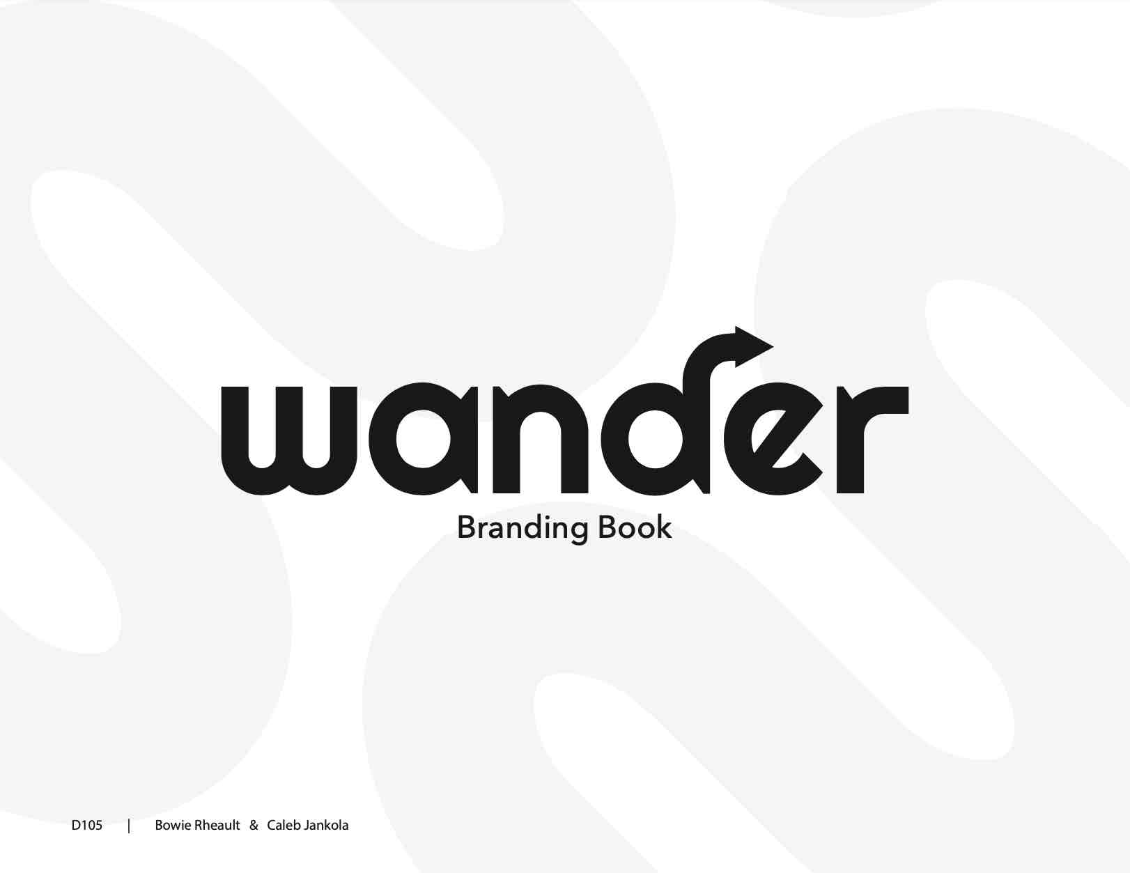
- Branding book
- Business Card
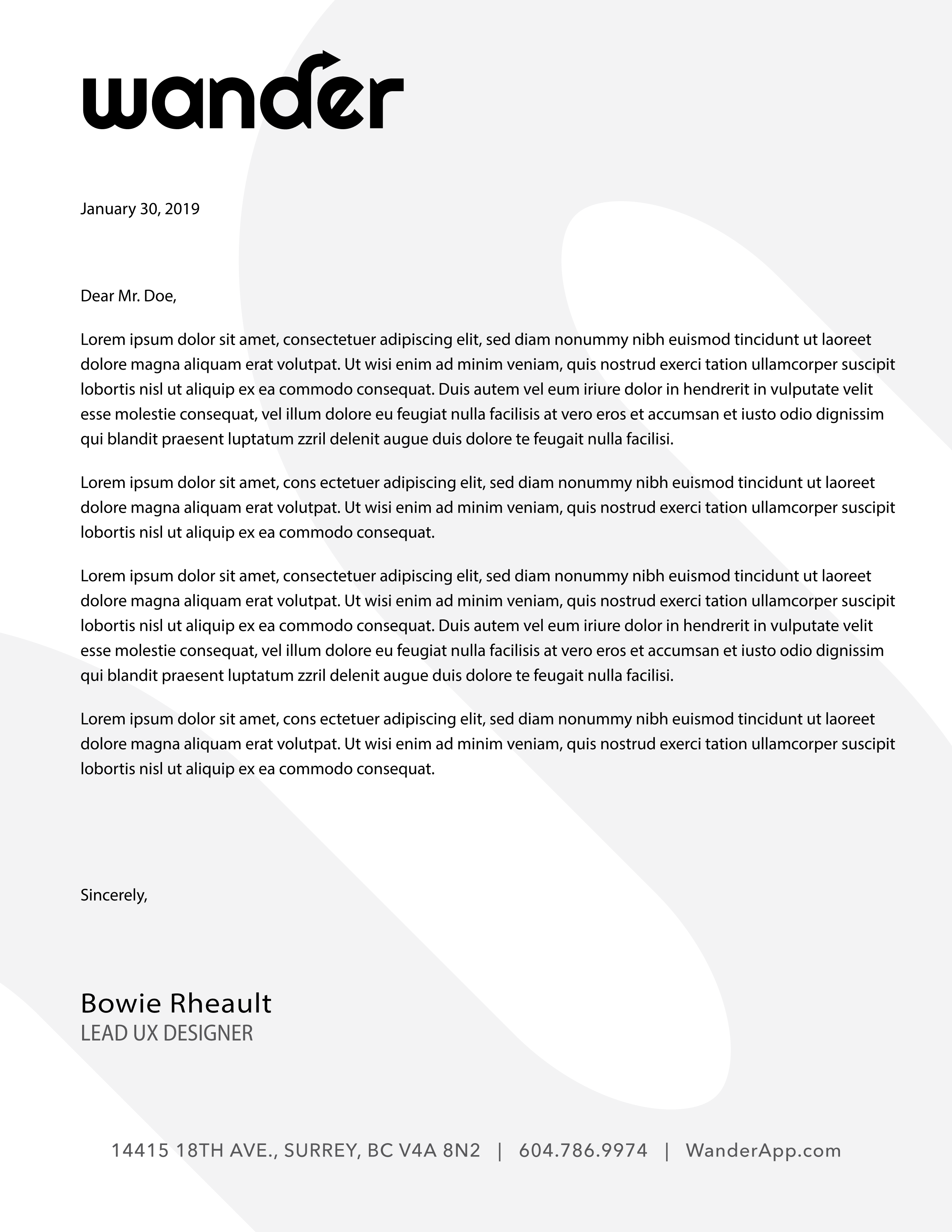
- Letterhead
Division of Labor
- Bowie Rheault
- Company + logo ideation
- Development of all deliverables
- Caleb Jankola
- Company + logo ideation
- Feedback on deliverables
- Created presentation to class
Approach
The first step we need to complete was coming up with an idea for our brand. I performed rapid brainstorming on post-it notes, writing down all the ideas that came to mind.
We explored inventing companies across a variety of industries, and landed on a nature travel assistant app called Wander. Users can plan outdoor vacations such as hiking trips using the various features of the Wander app. The primary purpose of Wander was to enable users to explore all that nature has to offer near them.
Logo
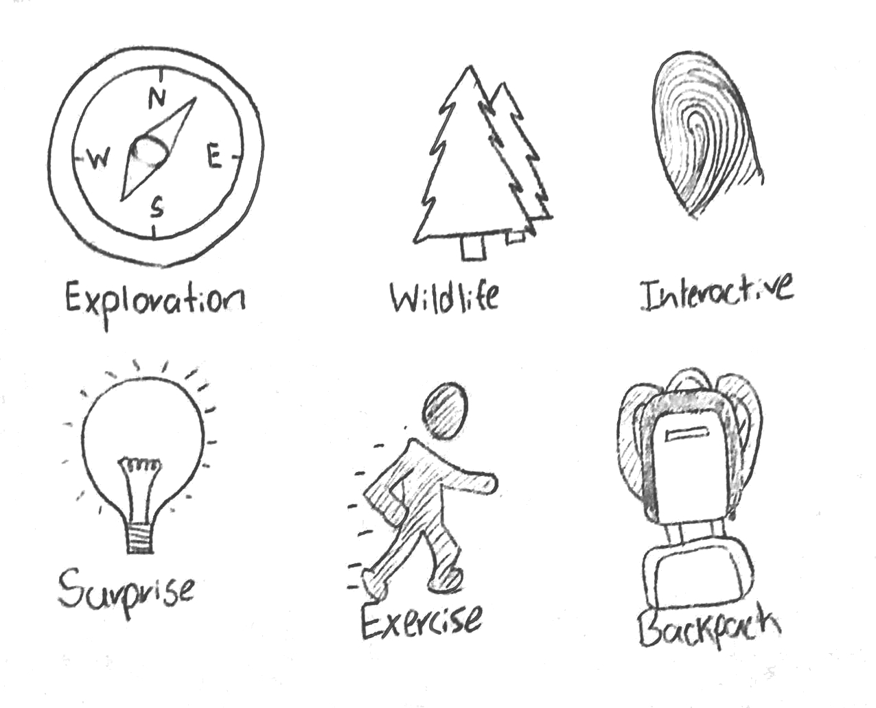
Using a symbol ideation exercise, I explored a variety of logo ideas. It didn't take long before the arrow emerged as one of the essential components of the logo. To represent both travel (as in movement) and direction (as seen on a compass).

Wordmark
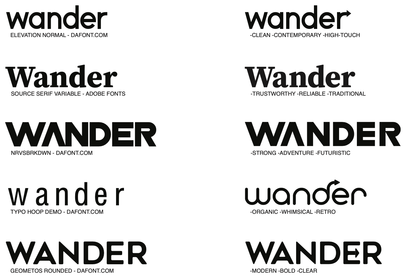
These are some examples of wordmarks I explored for the brand. On the left side I compiled a number of potential fonts that could be used. On the right, I tweaked the kernings for those fonts, and in some cases added the "arrow". I also took note of the associations I had with each of the wordmarks.
Final Results

